Yelena Dobric
Yelena Dobric
Sentiment, Topic and Attention Analyzer, machine learning model (for an asset management company)
Situation:
Machine learning model analyzes topic, sentiment, and attention (topic pervasiveness) in financial documents, and transcripts.
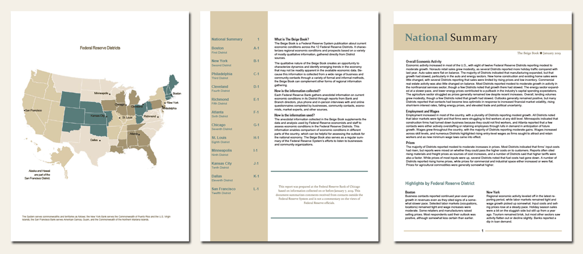
Beige Book is an example of a financial document. It's a summary of commentary on current economic conditions by Federal Reserve District. It is published 8 times a year and it is public domain.
Earnings call is an example of a transcript. It is a conference call between the management of a public company, analysts, investors and the media to discuss the company's financial results during a given reporting period, such as a quarter or a fiscal year.
Personas:
Creators: Portfolio Manager came up with these concepts, of how to analyze these financial documents. Macro Economist was with us, in the trenches, obtaining feedback from users, and advising on features and priorities.
Users: Analysts & Traders.Task:
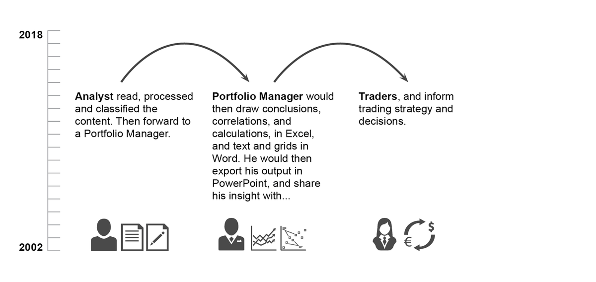
Client had this contraption working in Excel, for 15 years. They were doing the analysis manually (see flow graphics below). They then shared the findings in PowerPoints, and Word documents. The task was digital transformation. Sapient team built a machine learning model. Sentiment Analyzer is a web app that lives on a platform, with other machine learning models.
Action:
As the only UX resource on this project, my role was:
● I weaved client's whiteboard sketches into an intuitive flow.● Structured interaction and information to accommodate how we read; "Human brain needs meaning before details".
● Enabled model training in the UI, by designing how the one power user can override classification and sentiment.
● Enabled all other users to provide feedback, directly in the UI.
● Provided 3 different types of data visualization, and the ability to interrogate that data, to build trust with users and increase model adoption.
Goal:
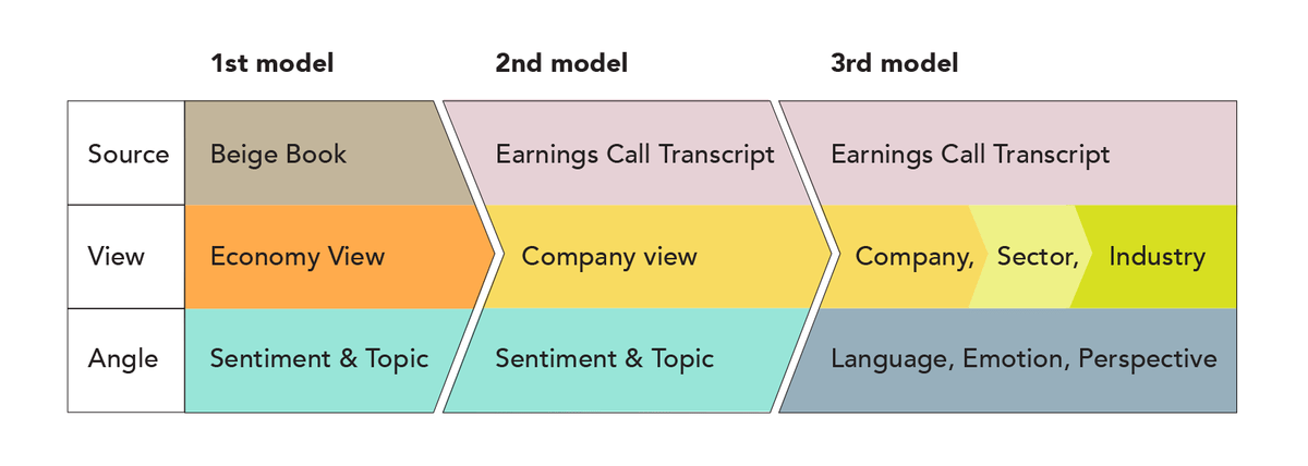
Beige Book analysis is on an economy level, so the goal is to inform institutional users about changes in the market and to help spot signals.
ECT (Earnings Call Transcript) analysis is on a company level, so the goal is to inform institutional users' BUY/SELL decisions, as it points out potential trouble, bankruptcy, etc.
Note: Model is not meant to be panacea, nor the only source of truth. But it is a unique perspective, an additional viewpoint, that relies only on data and data analysis.Team:
On Sapient's end, we had 2 Product Managers, 2 Senior Data Scientists, Business Analyst, and Front and Back End developers. On client's end, teaming up with us, we had the Portfolio Manager, and a Macro Economist.
Challenge:
• Users were breathing down our necks to put the model in production as soon as possible, and we did not have enough people.
• Because my Product manager was promoted in the middle of all this, the folks who inherited his duties, were not uber familiar with who to invite to which meeting. As a result, I wasn’t invited to a lot of meetings. Thus, I did not have all, or complete information. But like they say, "When doors are closed, find a window."Result:
• 90% accuracy at the launch
• 10x faster process, than the manual process, client used previously, using Excel and PPT
• The Beige Book model was so popular, that it spurred another model build: Beige Book's infrastructure applied to Earnings Calls transcripts.
ECT was a considerably bigger feat, because ECT data is not as structured as the Beige Book. However, even the ECT model was successful, and it actually spurred the 3rd model we built, where we analyzed ECT, from emotion and perspective viewpoint.
More about the Beige Book
Each Federal Reserve Bank gathers anecdotal information on current economic conditions in its District through reports from Bank and Branch directors and interviews with key business contacts, economists, market experts, and other sources. The Beige Book summarizes this information by District and sector. An overall summary of the twelve district reports is prepared by a designated Federal Reserve Bank on a rotating basis.
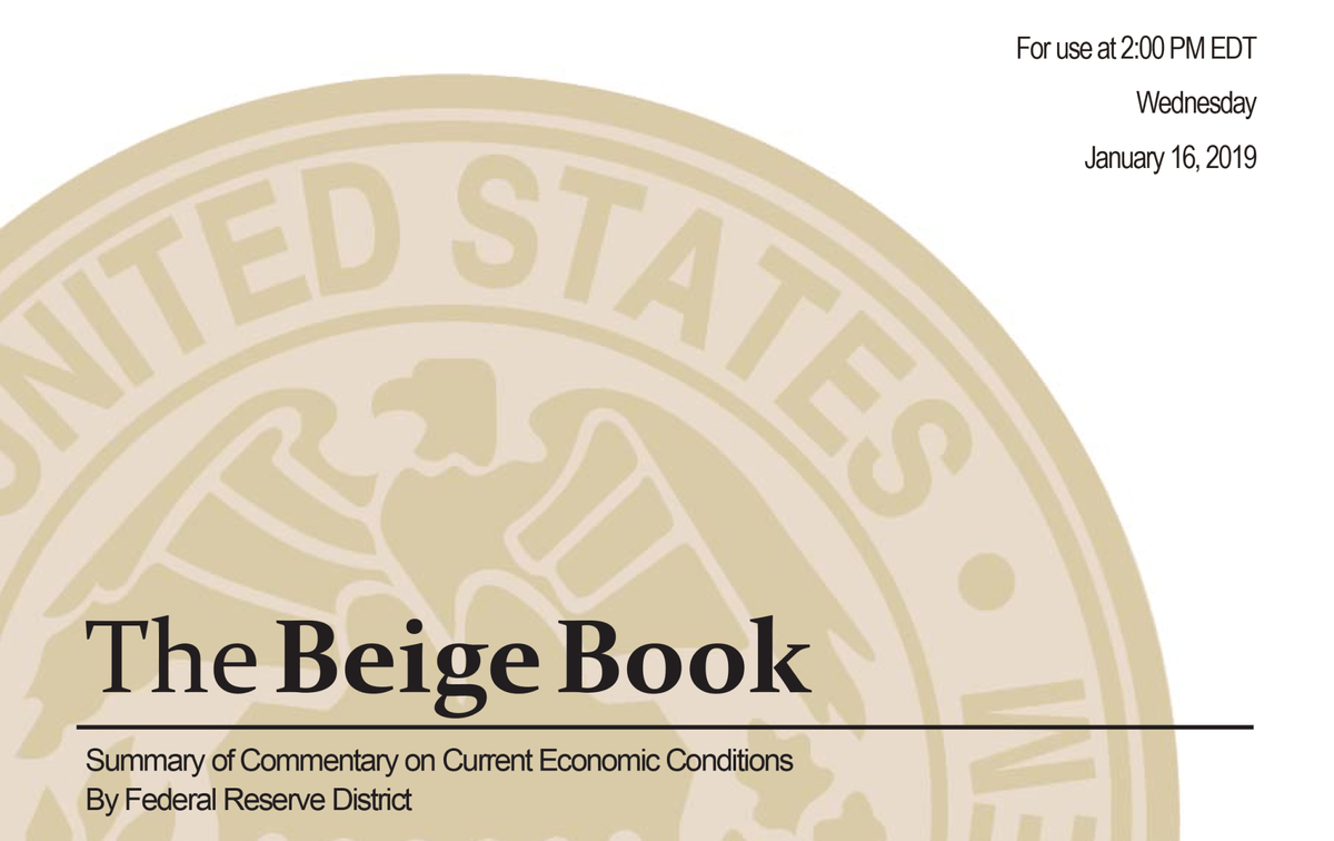
Beige Book structure and content preview, in its original form.
Beige Book analysis, at this particular asset management company, 2002-2019, was done manually. My team set out to create a digital version of it. To scale (serve more users) and faster.
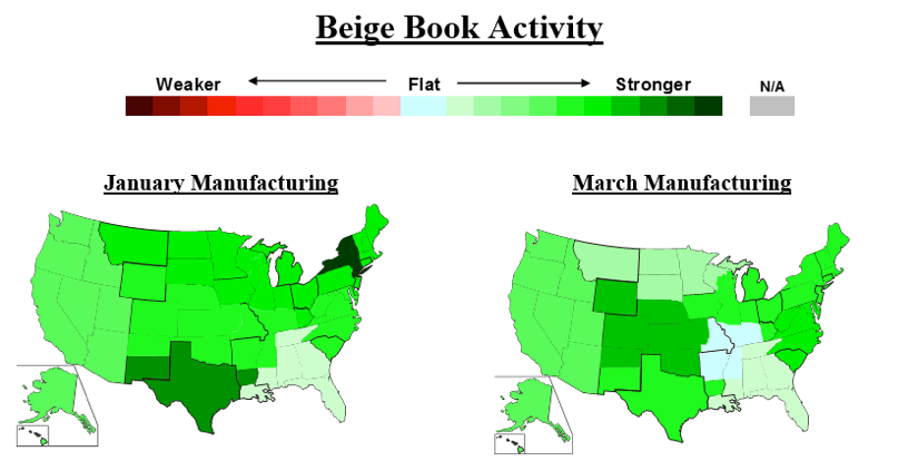
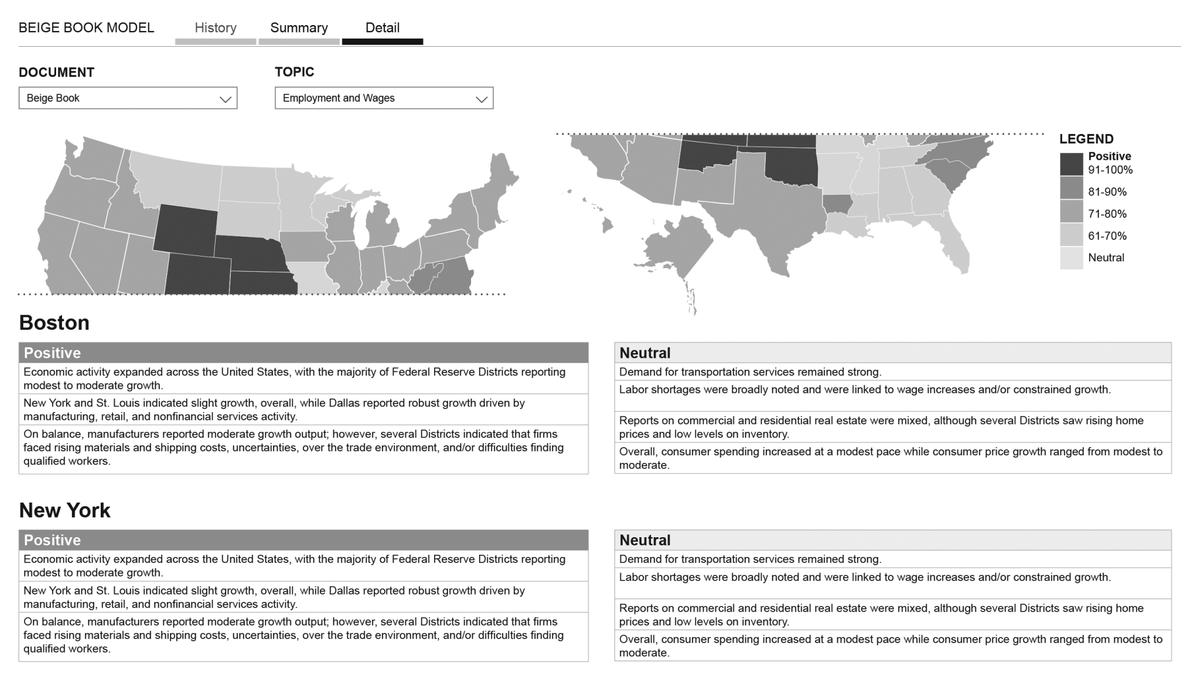
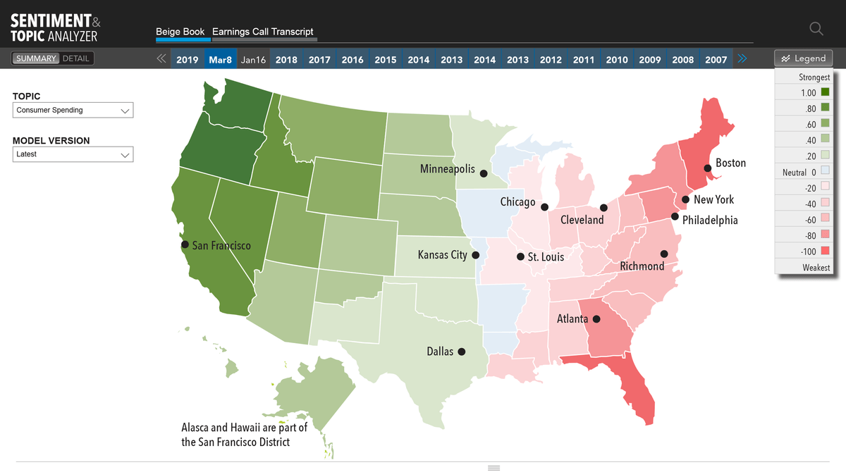
Beige Book: Model labels each sentence, to identify topic and sentiment. User chooses a topic, and model shows the sentiment, on that topic. Sentiment ranges from positive to negative, on a scale from 1-10. Geographic map represents high level overview.
This is how some of the analog output looked like, in Excel. The map represents Federal Reserve Districts, and each has its own sentiment.
My team set out to build:
1. Machine learning model that provides 17-year look-back
2. Enables data interrogation, historical comparison, and model training directly from the UI.
We started whiteboarding and brainstorming. My role was to weave client's whiteboard sketches into an intuitive flow.
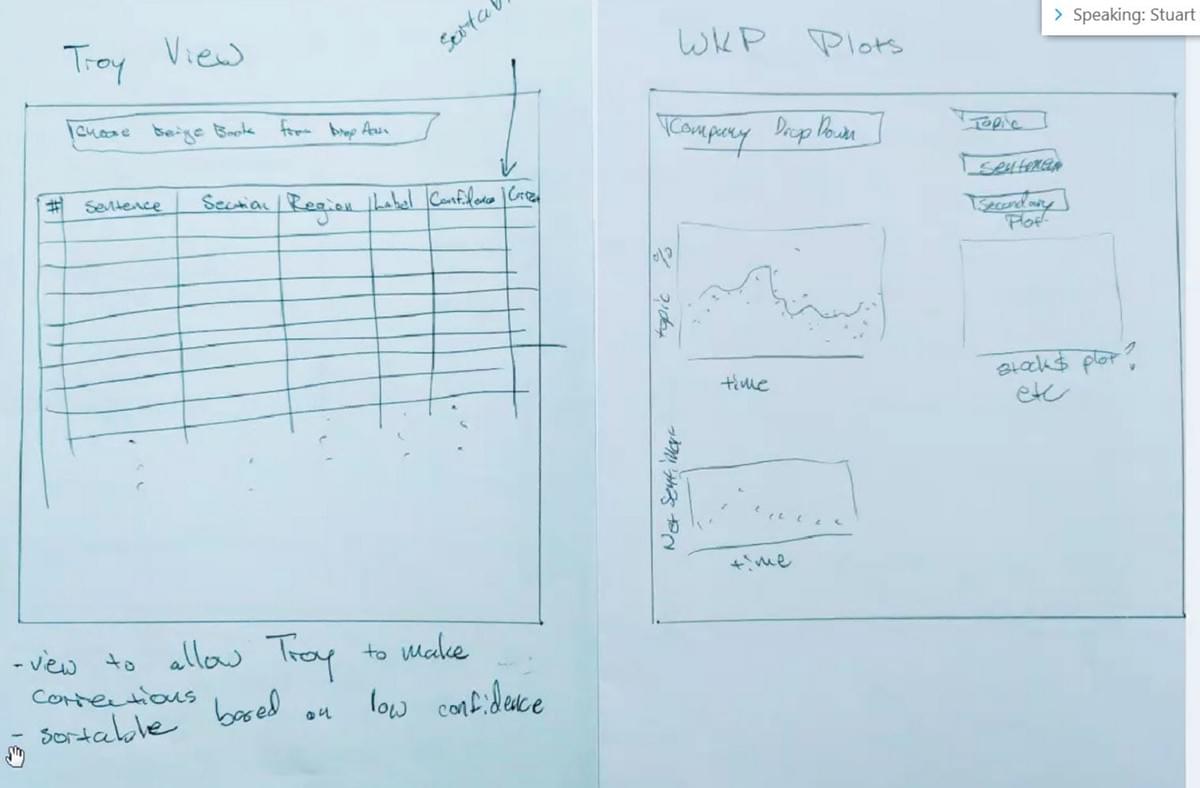
My role was also to structure interaction and information to accommodate how we read; "Human brain needs meaning before details".
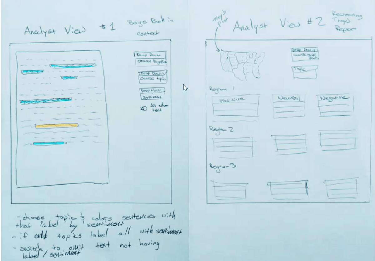
I was drawing my own sketches and ideas, of how we can best present and combine the data.
I explored various information pairings with my Product Manager, and outlined pros and cons of each to the team.
Basic elements of the app were:
1. High level overview from which you can enter into a variety of...
2. Detail views
3. Plus historical analysis, for comparison purposes and putting data into context.
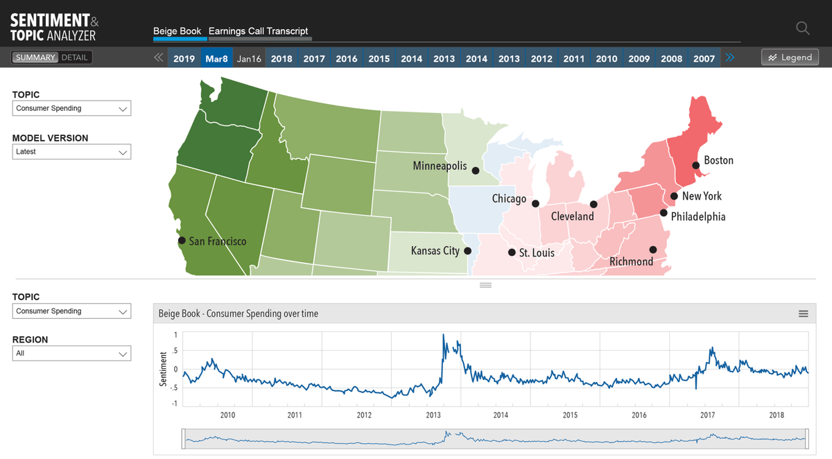
Standard container for the model provided:
1. Single header, in which you can choose the time period, for Beige Book/s.
2. Topic and Model Version
3. Legend - that changed values, pending display, but not the structure or the location.
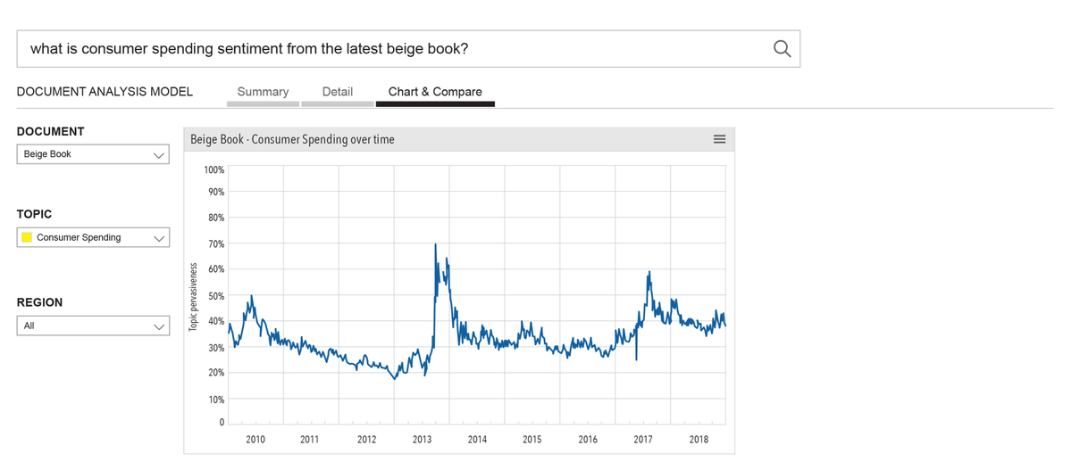
To add more perspective and context, user can add a view over time. To reveal the line chart, user moves the horizontal bar.
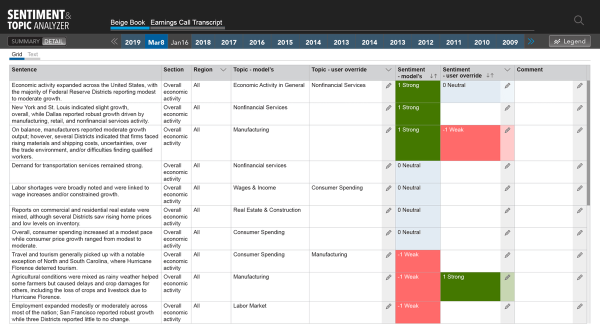
Grid view provides:
1. Breaks the content down, by sentence. You loose some of the context, cause it’s broken in a very unnatural manner, but you see parsing crystal clear.
2. The ability to interrogate the data, with filters and sorting. Which you cannot do in any other view.
3. I enabled model training directly in the UI, by enabling the one power user to override classification of topic, and ranking of sentiment.
4. Enables all other users to provide feedback, directly in the UI.
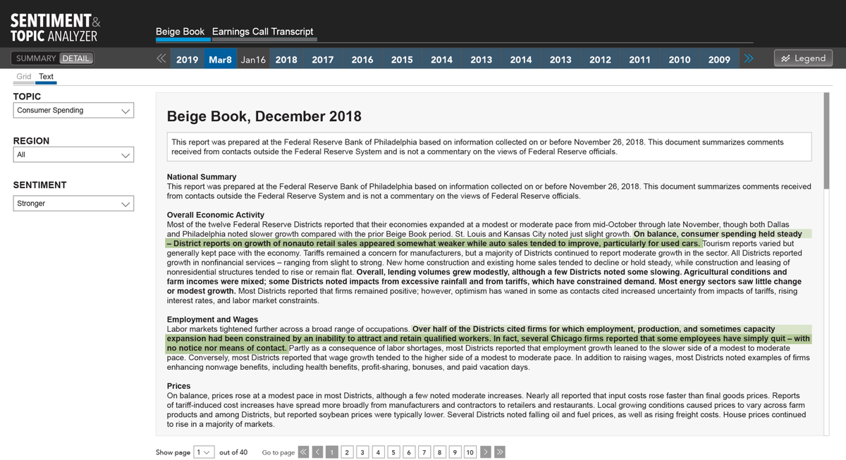
Text view enables:
1. User to see the classification of individual sentences, and words,
2. Allows the user to see Attention Score, or topic pervasiveness. How much did they talk about, Consumer Spending, in New York? And within Consumer Spending, what was trending: retail spending, or tourism spending, for example?
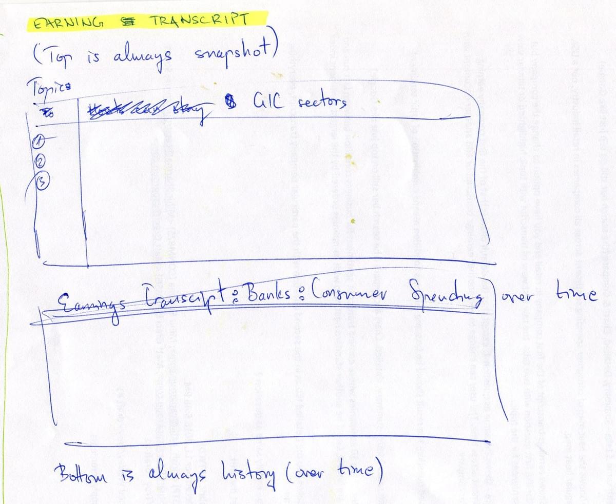
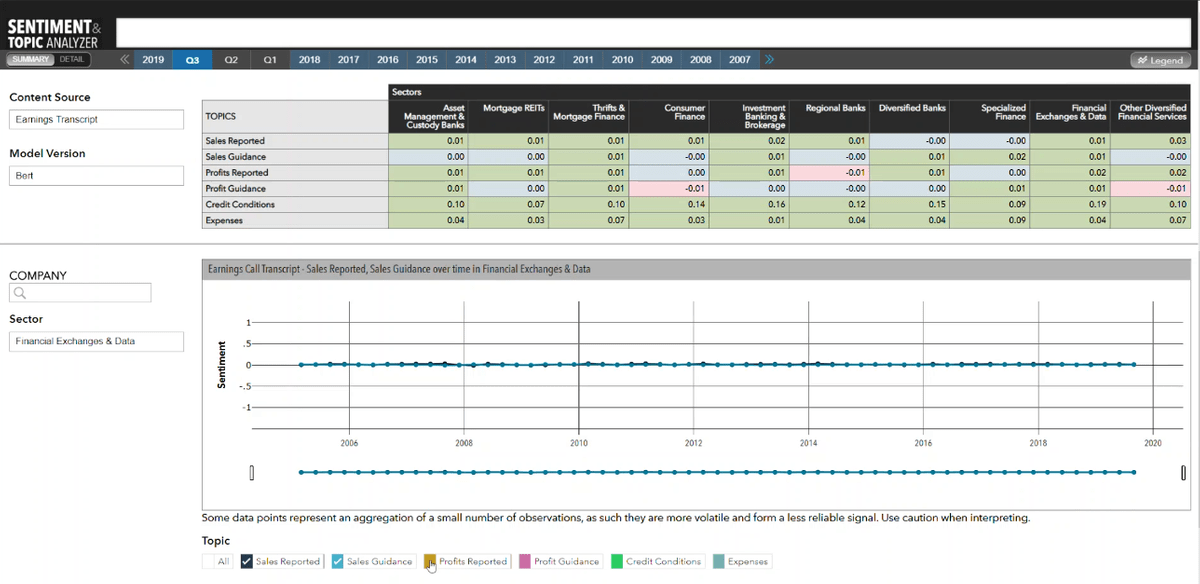
Changing the content source, from Beige Book to ECT (earnings call transcript), in the "Content Source" dropdown.
When we switched from Beige Book, to Earnings Call Transcript, we had to come up with our own Topics. Initially, we had 17 topics.
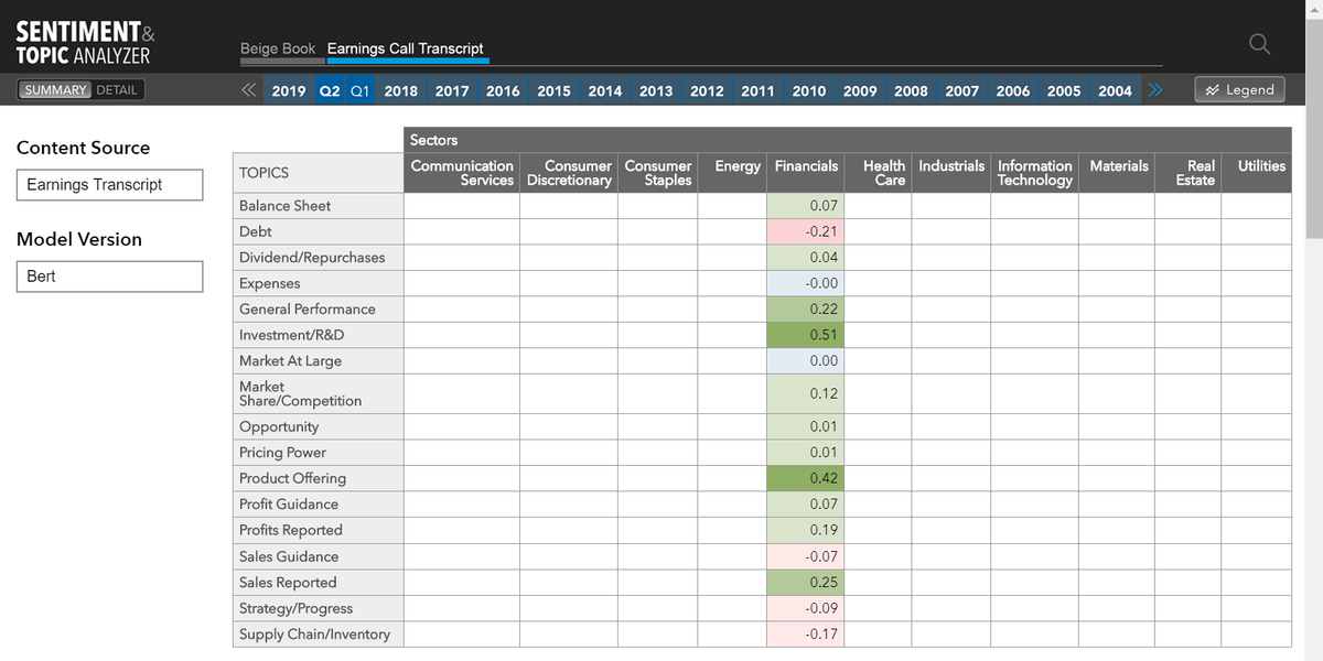
Topic evolution. We tested various topics with users, asking them about relevance and usefulness. We researched how each topic correlates with Sentiment and Attention. Eventually, we ended up with only 6 topics.
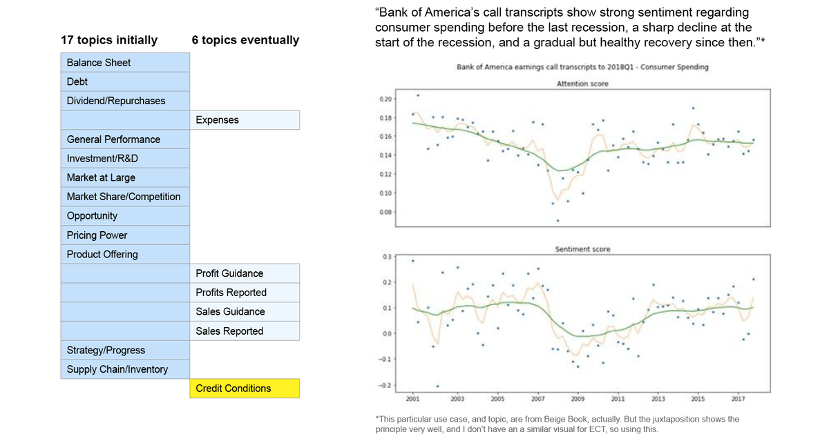
Final 6 topics implemented.
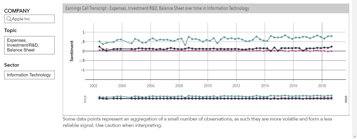
Sample use case: Time-series chart shows Apple consistently invests in Research & Development.
This is important, because we examined historical data, and found that companies who gradually, over the years, reduced funding for innovation and future, all eventually went bankrupt.
Model in Production. It is 3:16 minutes long. No sound.
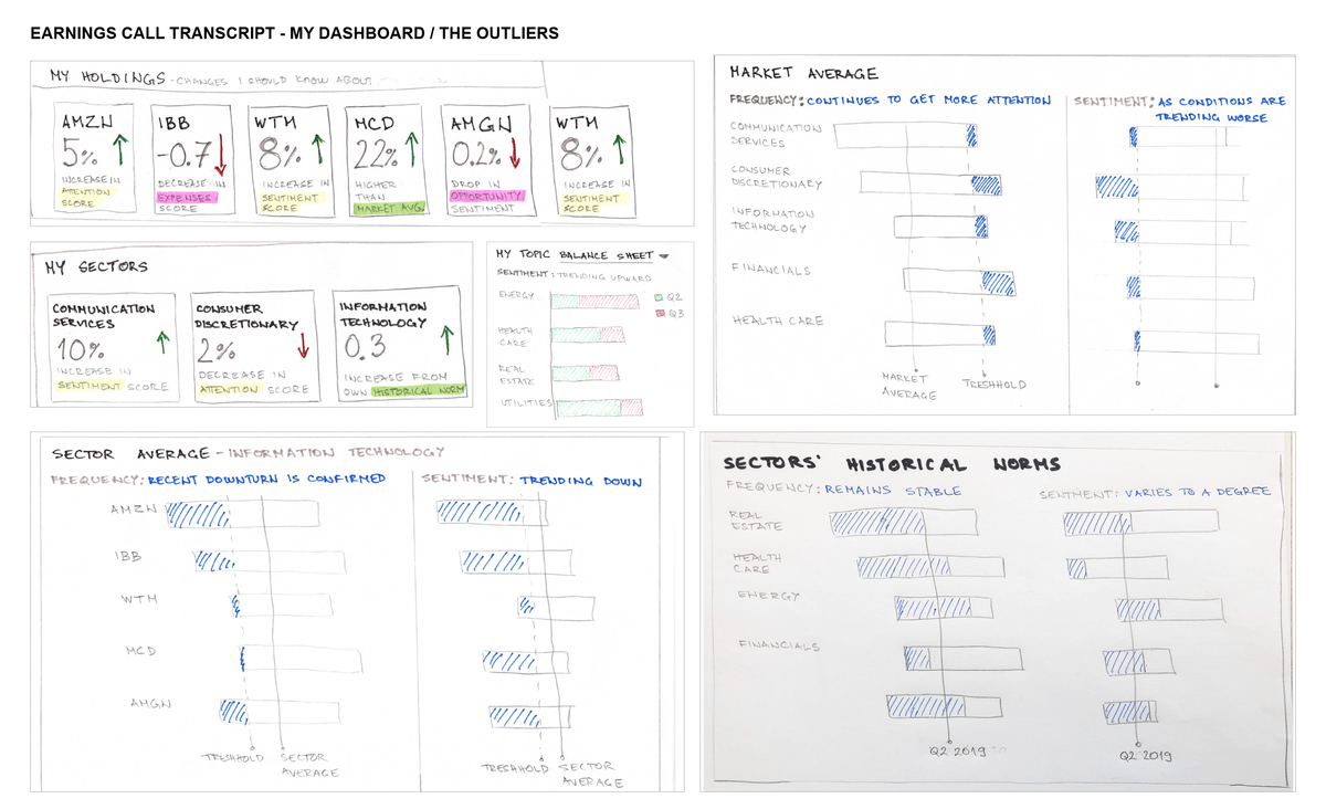
Future vision is providing even more context, for the data.
This is the story how our 1st model, inspired the 2nd (both are shown on this page), and the 2nd, inspired the 3rd (Language Analyzer, in this portfolio).