Yelena Dobric
Yelena Dobric
Data Visualization
Publicis Sapient published an article I wrote and designed all data vis for, as well
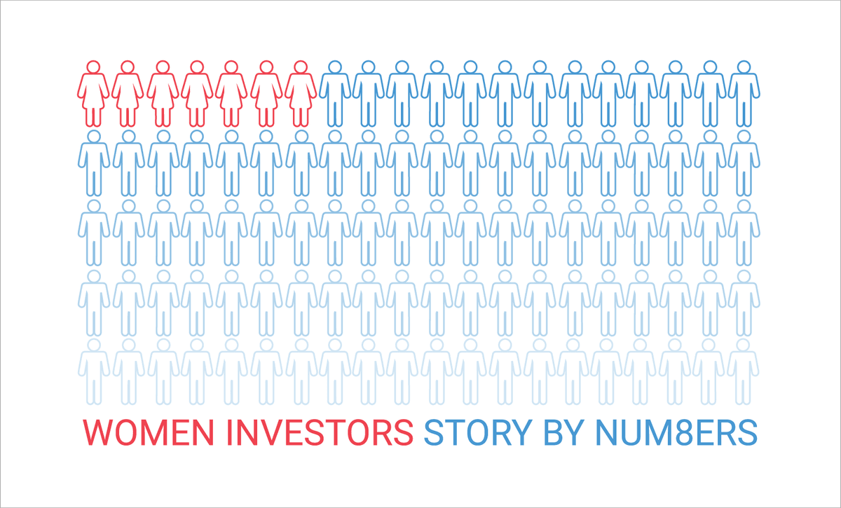
I designed several feature image options for my article about women and investing. See the final story here. Please note that I designed all data visualizations in the article.
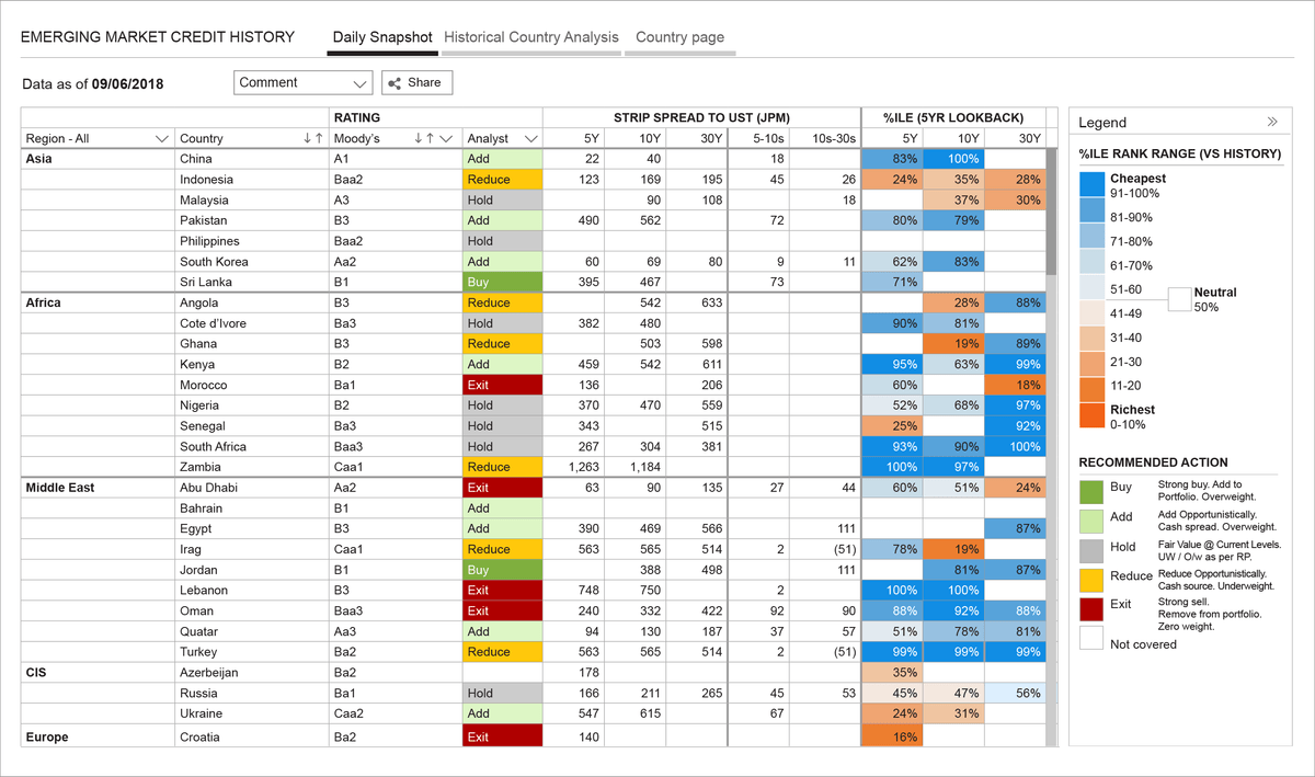
Emerging Markets Credit History
An app designed for a Portfolio Manager in Asset Management, enabling them to communicate strategic directions to the trading floor.
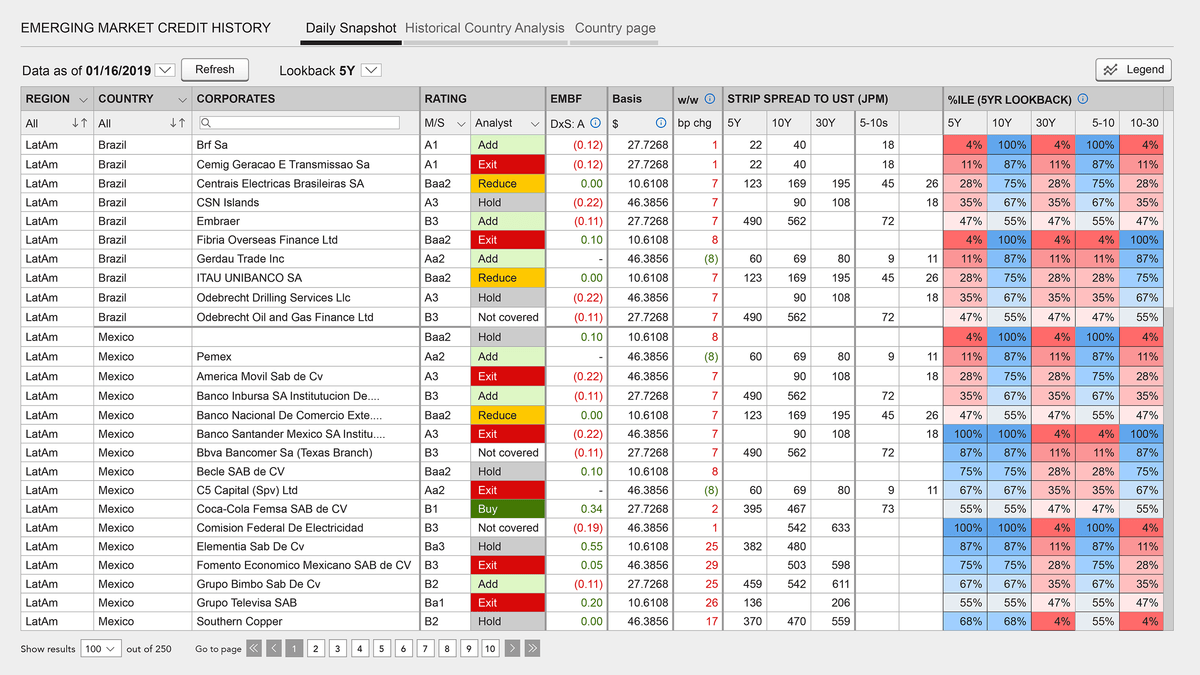
The legend has been expanded, allowing you to learn more about the meaning of each action. I am also experimenting with various shades of blue and red.
Sentiment Analyzer, machine learning model
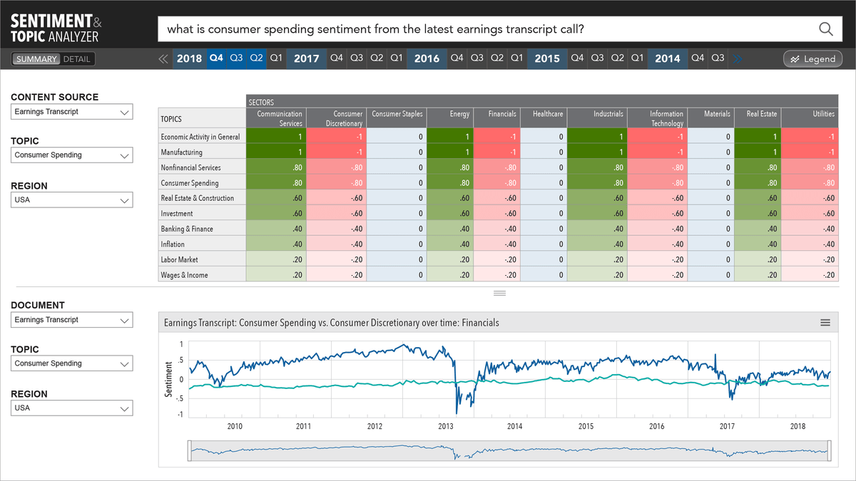
Corpus of data / content source being analyzed: Earnings Calls' Transcripts. Asset management firm. Fixed Income division. Investment research purpose. View by sector. See the full project here. Heatmap is the answer to the question user asked in the chat box: What is consumer spending from the latest Earnings Call Transcript? Top heatmap is a snapshot, bottom line chart is context: the topic though time and wider comparison.
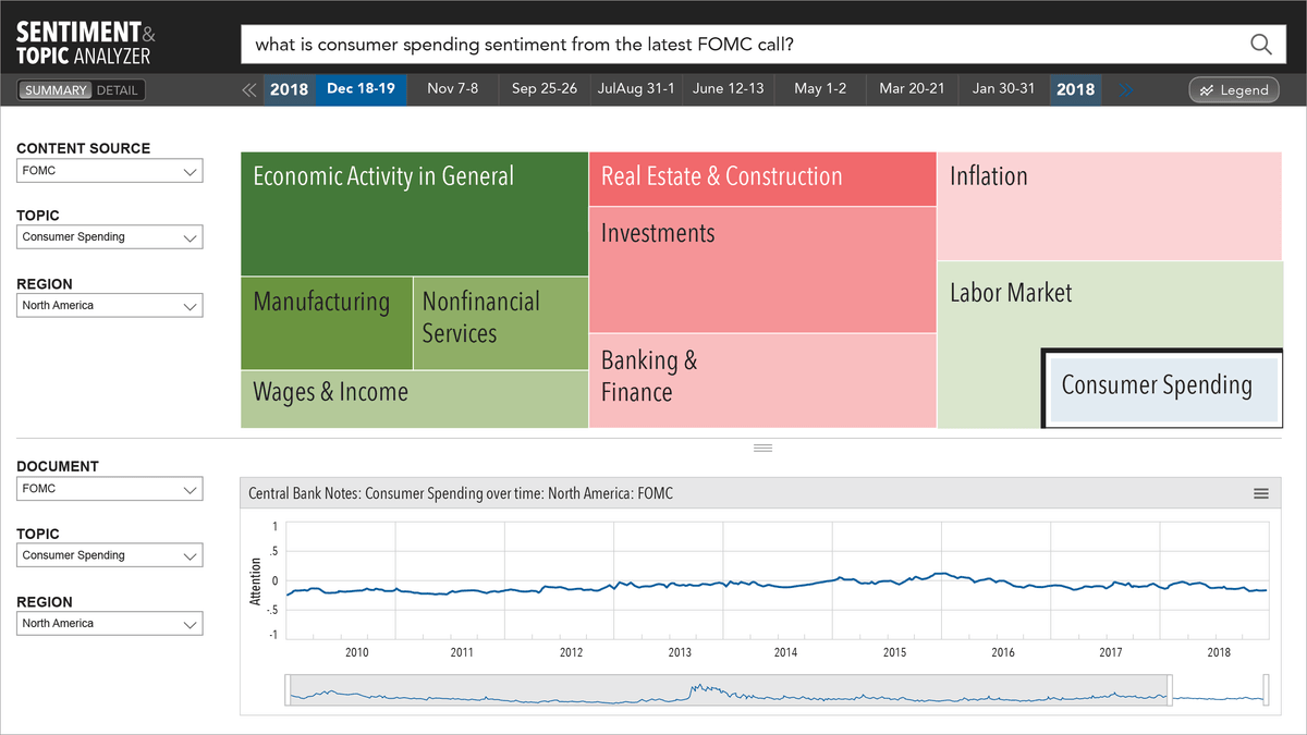
Corpus of data / content source being analyzed: Federal Open Market Committee Meeting Minutes. Treemap is the answer to the question user asked in the chat box: What is consumer spending from the latest Federal Open Market Committe call? Color in this treemap shows the sentiment towards each sector, and size of the box shows how much the sector was talked about in the FOMC call. Top treemap is a snapshot, bottom line chart is context: the topic though time and in a particular geo region.
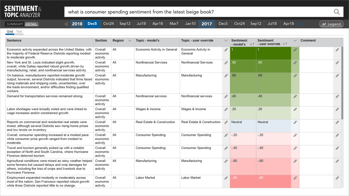
Corpus of data / content source being analyzed: Beige Book/s. Sentence view where each sentence is assigned sentiment, and then those sentences in aggregate determine overall sentiment of a single editioon of the Beige Book, or by sector, geographic region, etc. Sentiment is the answer to the question user asked in the chat box: What is consumer spending from the latest Beige Book?
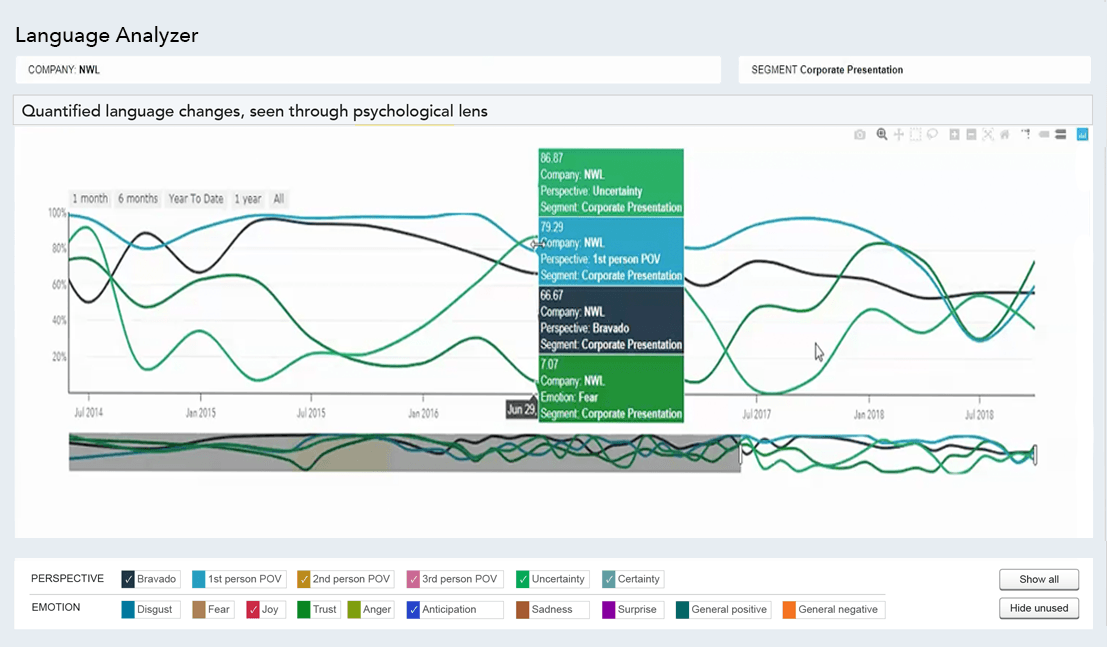
Language Analyzer, AI and NLP (Natural Language Processing).
Corpus of data / content source being analyzed: Earnings Calls' Transcripts. . The model analyzes emotion and perspective. Asset management firm. Fixed Income division. Investment research purpose. See the full project here.
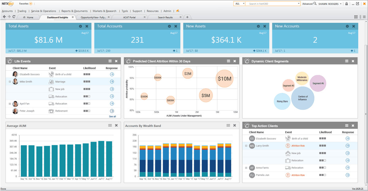
BNY Mellon. NetX360 product.
This dashboard is designed for financial advisors. The top blue tiles and widget framework were fixed and could not be modified; my design work focused solely on the content within the widgets. You can view the full project here.
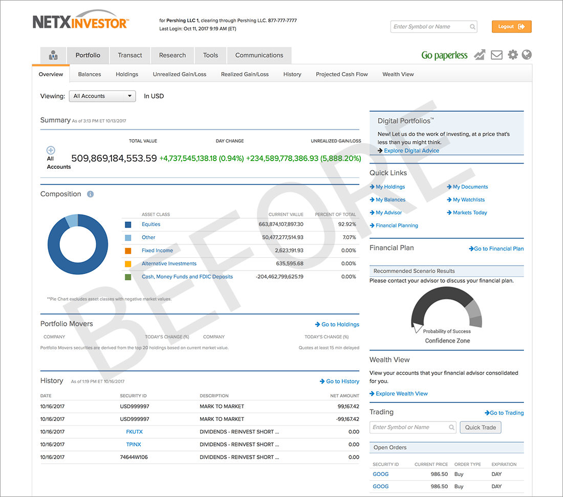
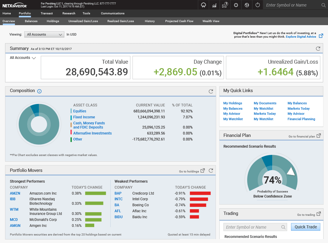
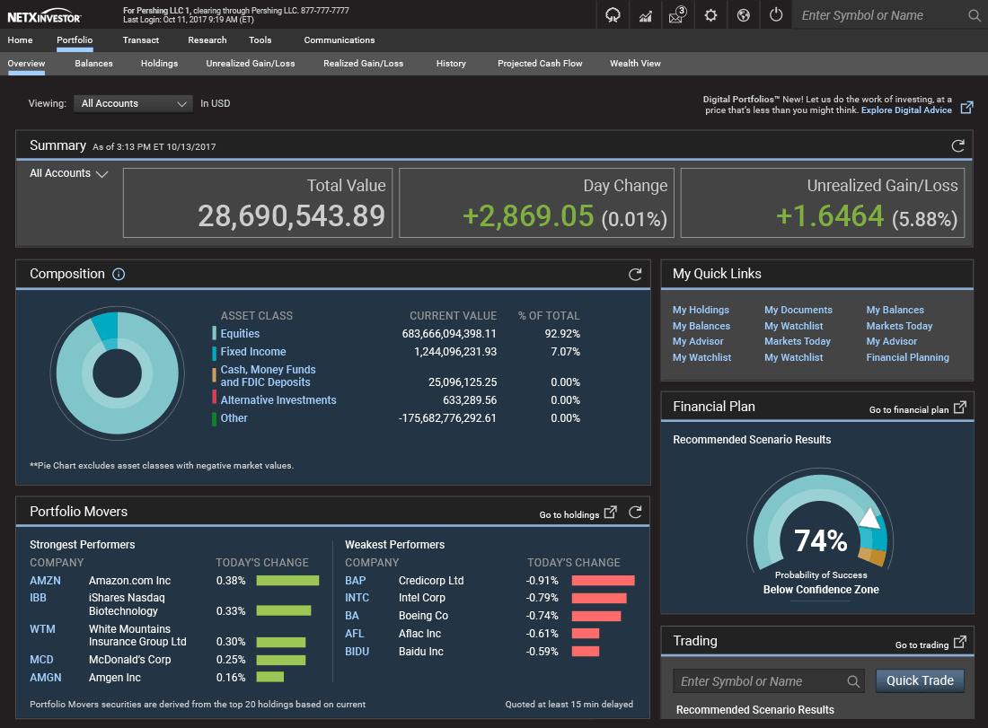
NetX Investor
Dashboard for individual, retail investors. This is the "Before", and below are my redesigns for Day and Night theme.
Dashboard for individual, retail investors. My redesign. Day theme.
Dashboard for individual, retail investors. My redesign. Night theme.
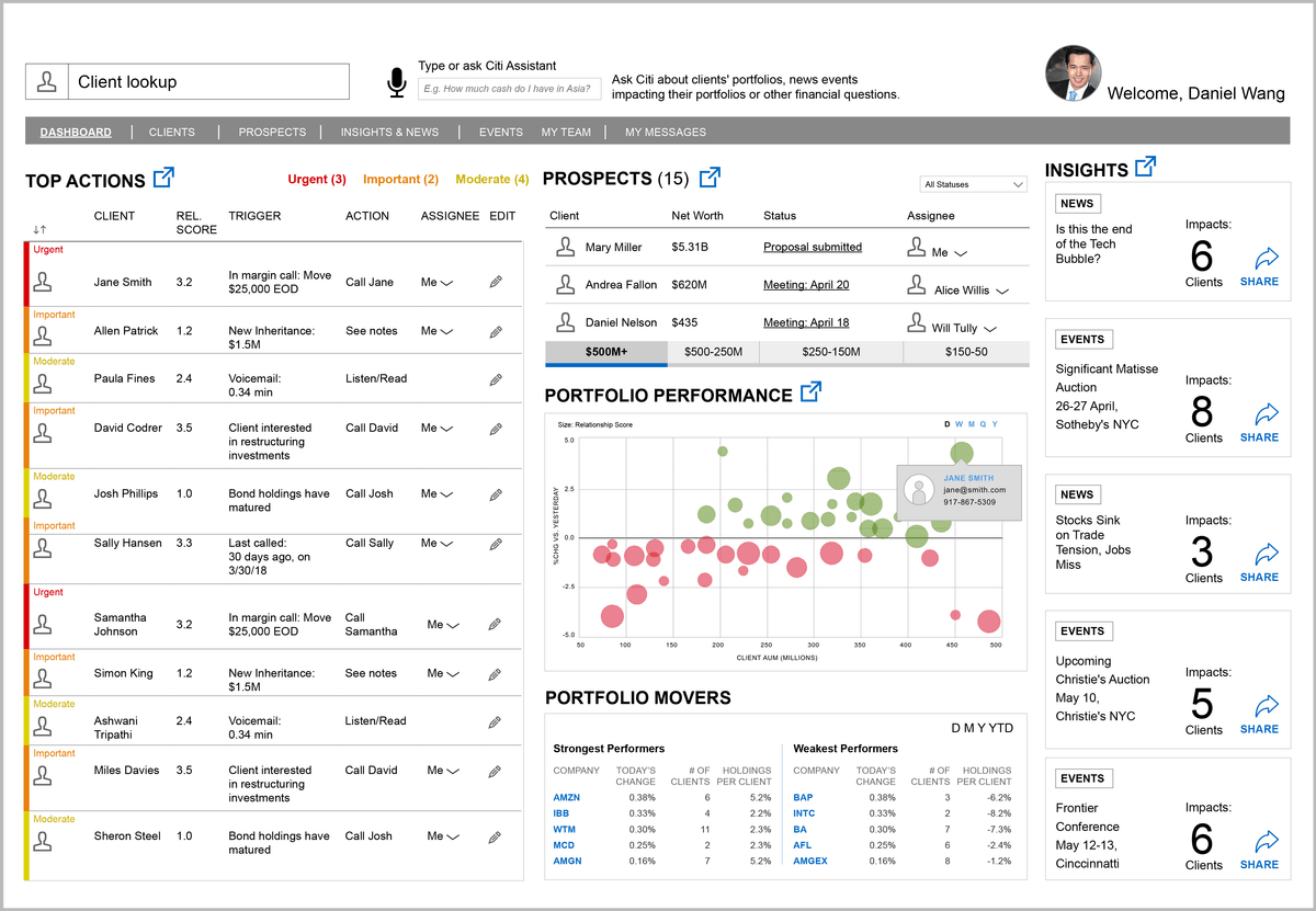
Citibank dashboard design for a private banker
This project was a rapid design created for a pitch that Publicis Sapient presented to an existing client.
J.P. Morgan global balances map for CFOs
The map shows to a CFO where they have funds, around the world.
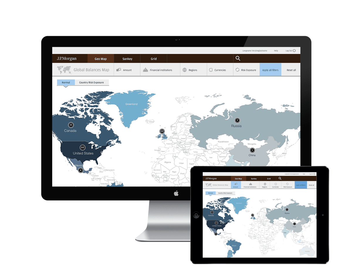
J.P. Morgan
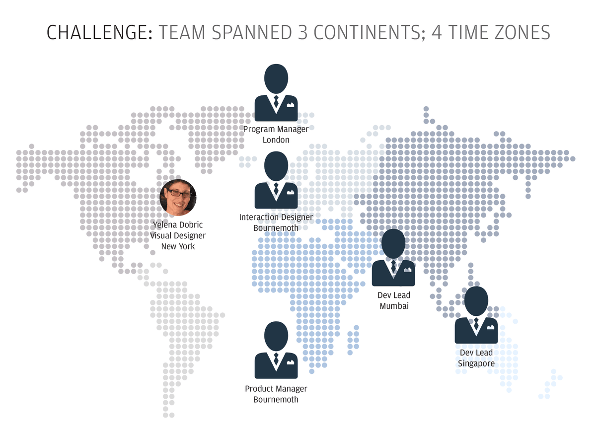
This slide, created for my project presentation, visually illustrates the challenges we faced as a distributed team.